
It has been a bit quiet here, but don’t worry! Behind the scenes, I’m working on new swatches. I managed to get my hands on seven new shades of OPI’s new Nature strong collection called ‘Even more flowerful’! The collection consists of five new creme shades, two new glitters, one shimmer, and a basecoat. I skipped the glitters, but I might pick them up in the future, because they are really cute too! This collection should be available basically everywhere right now.
I’ve already talked a lot about the whole ‘Nature strong’ story before. OPI claims that up to 75.6% of the ingredients are of natural origin and 84% are bio-sourced. Also, the packaging contains some recycled material. The nail polish applies the same as OPI’s regular formula. Although I like the fact that more and more companies are investing in plant-based nail polish formulas, I’m also a bit skeptical. The fact that something is plant-based doesn’t mean that something is ‘non-toxic’ or per definition better for the environment, it could easily be that the production of these plant-based shades requires more water for example. If you read OPI’s text carefully, you see that they also don’t explicitly state that it’s healthier or better for the environment, so I guess they have no data to back up claims like this. What I do like, is that by making nail polish out of plants (instead of oil derivatives), they make use of a renewable source instead of a depletable one. However, for now, the plant-based story just seems to be an excuse for brands to release a more expensive product. After all, if it’s so good, why not discontinue the entire regular line and replace it with plant-based polish instead?
Anyway, since I’m not sure about the environmental impact of this plant-based collection, I just view it as another new spring collection. And it’s definitely a nice one! If you’re interested in a particular shade only, you might use these links to skip to it:
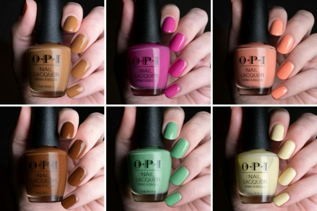
- OPI Bee the change (the yellow creme)
- OPI Big bluetiful planet (the blue creme)
- OPI Kind of a twig deal (the light pink creme)
- OPI Leaf by example (the dark green creme)
- OPI A kick in the bud (the medium pink creme)
- OPI Glowing places (the silver metallic)
- OPI Botanical base coat
OPI Bee the change

Bee the change was one of the shades that immediately caught my eye. It’s a beautiful warm marigold. I only had to use two coats for full opacity, which is really amazing for a yellow. Bee the change is really nice and vibrant, but it also has some dustiness to it, which makes it very wearable (but also makes it a bit of an ugly pretty shade).
>>BUY BEE THE CHANGE OVER HERE ON AMAZON (affiliate link)<<

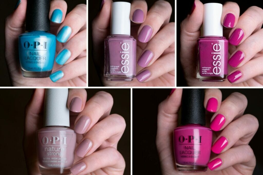
Of course, Bee the change reminded me of some other shades I own. I had the feeling that it would be very close to Essie Break it sundown. Both shades are indeed pretty close, however, Bee the change leans a bit more orange than break it sundown. If I had to pick one of the two, I’d still pick Break it sundown, but that was probably my favorite shade of last year! I also expected that OPI’s Marigolden hour would be pretty close to OPI Bee the change (especially because of its name), however, Marigolden hour really looks more like a ‘regular’ yellow to me. The same holds for OPI Sun, sea and sand in my pants.
OPI Big bluetiful planet
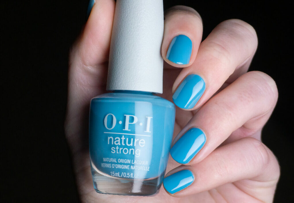
Another creme that immediately caught my eye: Big Bluetiful planet! This shade is just phenomenal! On OPI’s website, this color is described as a ‘subtle blue’, which is probably the worst description of this shade that you could have given me. It’s very clearly inspired by the sky on a warm spring day! Again, this shade only needed two coats to reach opacity and it’s just so vibrant!
>>BUY BIG BLUETIFUL PLANET OVER HERE ON AMAZON (affiliate link)<<

As far as comparisons go, another color from OPI’s Malibu collection came to mind, which is OPI Mali-blue shore. After comparing the two, I quickly realized that it’s probably the closest shade I own to Big bluetiful planet, but it’s definitely not a dupe. Mali-blue shore is a bit lighter and doesn’t have that drop of green that Big bluetiful planet has. Both are very pretty shades though! Essie’s Blue-la-la is a lot lighter than Big bluetiful planet and Essie You do blue contains a lot more purple. Definitely no dupes here!
OPI Kind of a twig deal
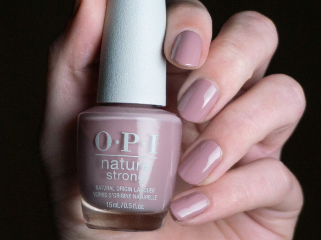
The last one, for now, is Kind of a twig deal. I considered skipping this one because it looked like it wouldn’t look good on me. However, I’m really glad I picked it up because it’s probably one of the better neutrals I have tried in a while! The color of Kind of a twig deal really depends on the lighting and your skin tone, but what I liked about it, is that it’s a lot cooler-toned than a lot of other neutrals. I only needed two coats for opacity, which is also a big win for such a light shade!
>>BUY KIND OF A TWIG DEAL OVER HERE ON AMAZON (affiliate link)<<

In the bottle, OPI Kind of a twig deal and OPI Somewhere over the rainbow mountains looked very similar. However, on the nail you can clearly see that Somewhere over the rainbow mountains is warm-toned, while Kind of a twig deal is cool-toned. The base color of OPI’s Quest for quartz is also really close to Kind of a twig deal, but it’s a bit more cool-toned and Quest for quartz obviously contains a lot of shimmer. Hollywood & vibe looked like it could be close to Kind of a twig deal, but on the nail, it looks entirely different and reminds me more of a strawberry milkshake.
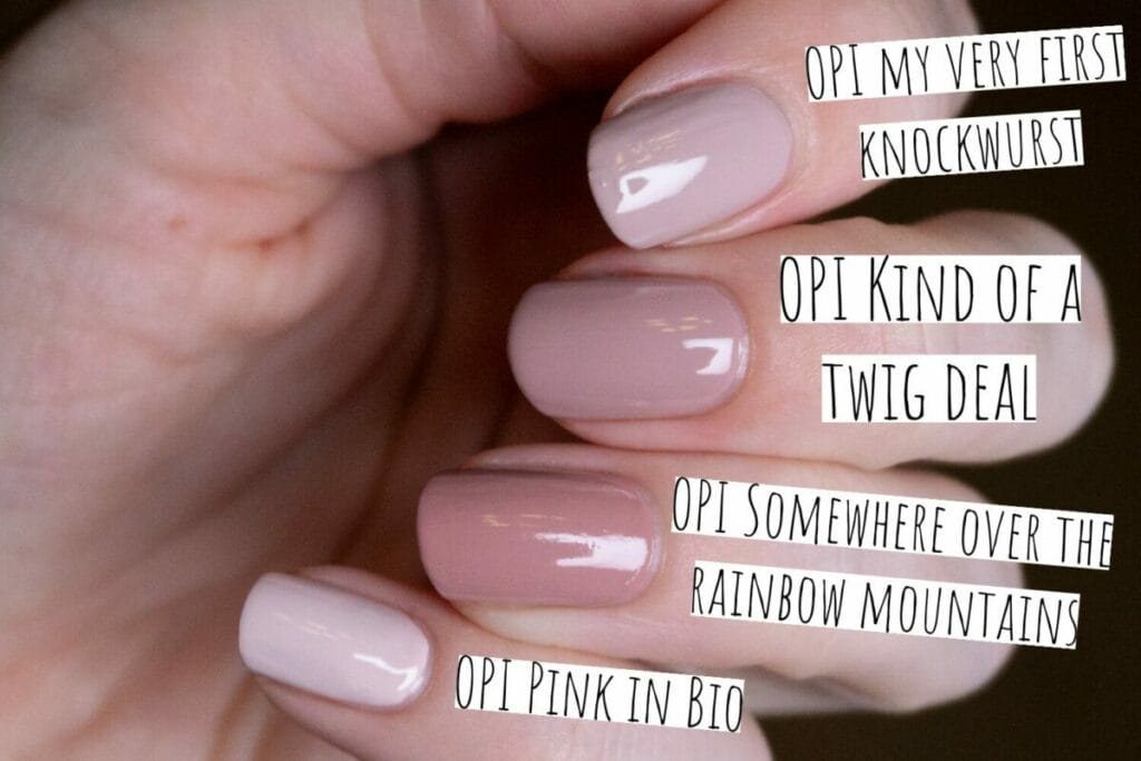
OPI My very first knockwurst and OPI Kind of a twig deal are definitely in the same color family. My very first knockwurst is just a bit lighter than Kind of a twig deal. I’ve also included the shade Pink in Bio, it’s clear that that one is also a lot lighter than Kind of a twig deal!
OPI Leaf by example

Of course, I was very excited about Leaf by example. OPI describes it as ‘an evergreen creme’. It’s very pretty, a darker green with just a hint of blue. What I was most amazed about by this shade, was the shine! It just looks so juicy and nice, already without the topcoat. It took me two coats to reach full opacity, but it was just so easy to apply! This is a huge advantage with these darker shades because they are usually a pain to clean up!
>>BUY LEAF BY EXAMPLE OVER HERE ON AMAZON (affiliate link)<<
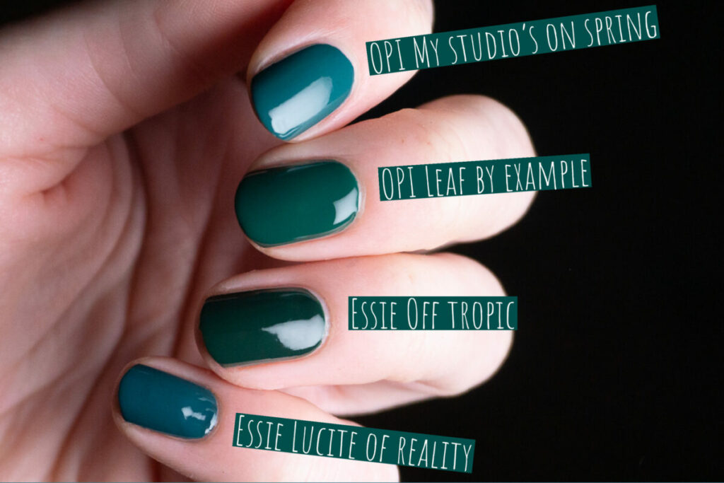
I’ve collected quite a few shades of green over the years. Of course, the first one that came to mind was Essie Off tropic. Off tropic has a pretty similar shade of green to Leaf by example, but the difference is that Off tropic is quite a bit darker. Essie’s Lucite of reality and OPI’s My studio’s on spring both contain too much blue to be a dupe for Leaf by example.
OPI A kick in the bud

OPI A kick in the bud is an electric pink crème. It’s not neon, but it’s very vibrant. I don’t wear pink shades like this often, but this particular shade is just so much fun! The polish itself has a bit of a jelly consistency but is opaque in two easy coats. The jelly formula gives it a very nice shine (I’m even wearing it without a topcoat in the picture). A very nice color, even if you’re not a pink lover!
>>BUY A KICK IN THE BUD OVER HERE ON AMAZON (affiliate link)<<

I probably could have pulled out a million pink shades in my stash to compare. OPI Strawberry Margarita is pretty close to OPI A kick in the bud, but A kick in the bud is slightly warmer toned. Essie Isle see you later is probably the closest shade I have to A kick in the bud, but Isle see you later is a tad cooler. Finally, to show you how warm A kick in the bud is, I’ve added OPI No turning back from Pink Street, which is very clearly much more cooler toned.
I also initially reached for shades like OPI’s She’s a bad muffuletta and OPI’s We Seafood and eat it, but both shades lean very red compared to OPI A kick in the bud.
OPI Glowing Places
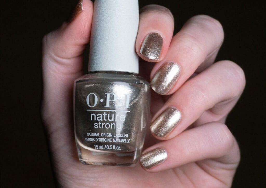
OPI Glowing places is described as an icy grey by OPI. In my opinion, it’s a warm silver metallic polish with a hint of gold. I’m not the biggest metallic nail polish fan, but I can appreciate this shade. It’s not streaky et all for a metallic and it’s incredibly reflective. The only downside with this polish is that it’s not super opaque and I needed three coats for opacity. I still want to try wearing this shade as a top coat over another color, I think it might look awesome.
>>BUY GLOWING PLACES OVER HERE ON AMAZON (affiliate link)<<

I wanted to do this comparison to show you that Glowing places isn’t quite a regular silver, but also not a gold or a rose gold. OPI Metallic composition is also a gorgeous shade, it contains larger particles than Glowing places and it’s also pinker.
Essie’s Jingle Belle is also a silver, but doesn’t have the warm undertones that OPI Glowing places has. Finally, Essie’s Getting Groovy is a regular gold, and it’s clearly much warmer and more yellow than Glowing places.
Nature strong Botanical base coat
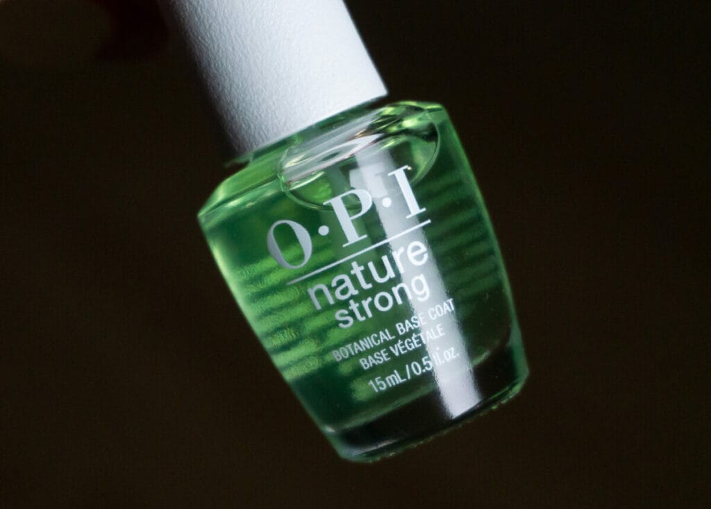
Part of this collection is also OPI Nature Strong’s new base coat called ‘Botanical base coat’. Although the Nature strong line did include a top coat, there was no base coat yet. This base coat is here to stay and is not a limited edition. The base coat has a green sheen to it and dries quickly. Although on the bottle it is just called ‘Botanical base coat’, I was able to find on OPI’s website that it has a 2-in-1 function; the base coat can be used as a base coat or worn alone as a fortifying treatment. Although it works fine as a base coat, I wouldn’t wear it alone since it gave my nails a slightly yellow look.
>>BUY BOTANICAL BASE COAT OVER HERE ON AMAZON (affiliate link)<<
Conclusion
I’m a lot more excited about this collection than I initially thought I would be. The colors are all very vibrant and apply very evenly. It fits the nature theme perfectly. I can’t believe I even considered skipping this collection!
The only downsides I can think of, are that OPI’s nature strong collection is a bit more expensive than the OPI classic formula, and that specifically, this collection seems to be a bit harder to find. However, if you manage to find these shades on sale, I definitely wouldn’t sleep on them!
Disclaimer: As an Amazon Associate, I earn from qualifying purchases.