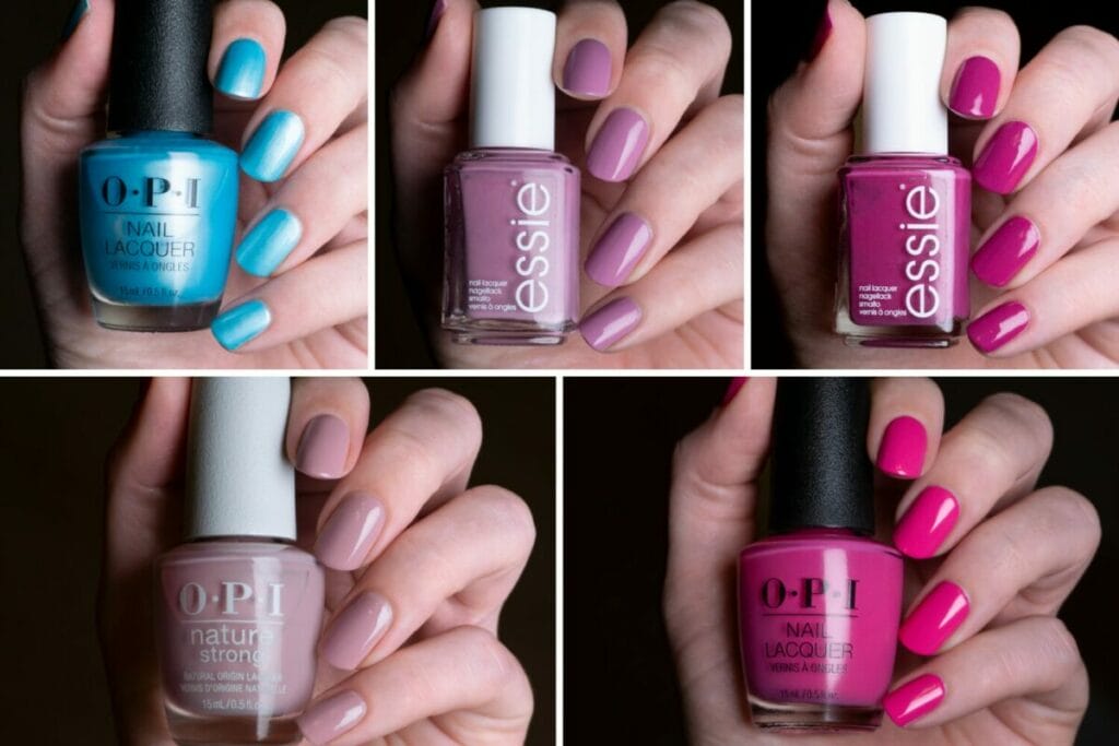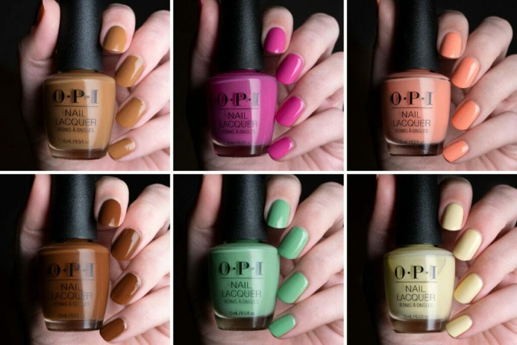
The OPI Summer 2022 Power of hue collection is officially released. I’ve talked a bit about this collection before, but I finally have swatches!
So just in case you missed it, a small recap. OPI’s new Power of hue collection consists of 12 new shimmers in bright colors. Although I absolutely love every color in this collection, I first decided to pick up my six favorite shades, just because I hadn’t seen any swatches yet. I might pick up more of them in the future, because I’m missing some that I really like, but for now I won’t. I hope these swatches and comparisons will help you make your choice!
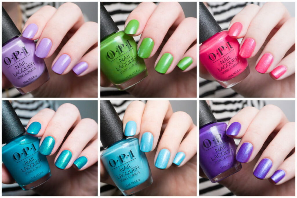
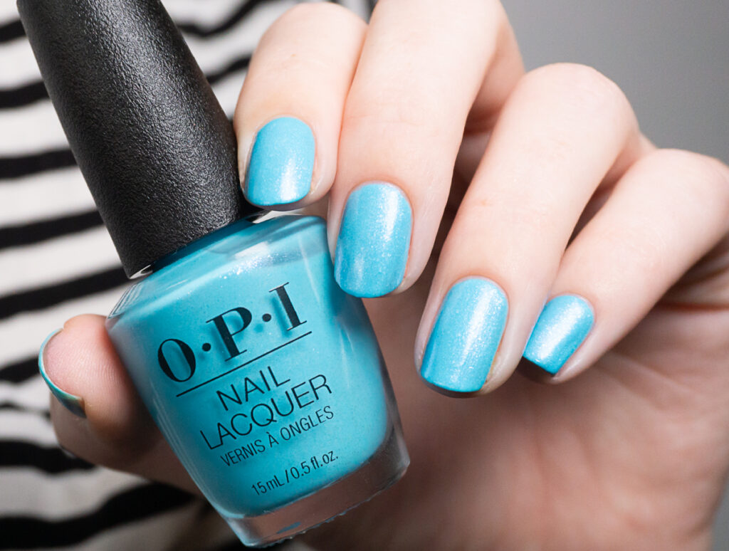
OPI Feel Blue-tiful
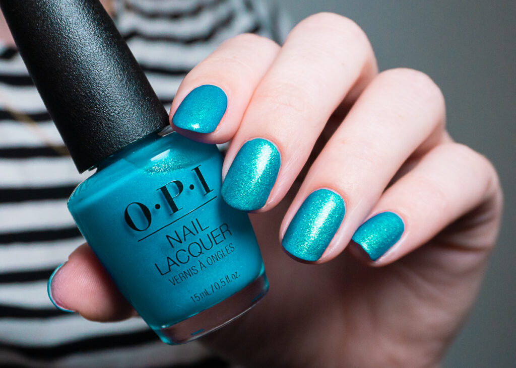
I wish I could show you Feel Bluetiful what it truly looked like. Don’t get me wrong, it looks nice in my picture, but it’s just much more vibrant in real life (almost neon). The name of Feel Bluetiful is a bit misleading because I would personally call it turquoise. It’s a bit different from the other shades that I picked up, in the sense that it’s the only one that contains gold flecks. It’s not the shy hidden gold sparkles that some other shades have, but it is a really in-your-face gold sparkle. It absolutely gives this shade a magic effect and I can’t stop looking at it.
The only downside of this polish is that it took me four coats to reach this level of opacity. I’ve seen others report that they got this one opaque in two-three coats. But at three coats I still had dark patches and I could see the whites on my ring finger. In all fairness, if you look closely at my picture you can still see the white of my ring finger, but I couldn’t really tell in real life because of all the sparkle.
The polish dries super quickly, so although I’m usually not a fan of doing four coats, it was really no big deal here. It also dries to a soft-matte finish, which looks quite good to me, but it also looks great with a glossy topcoat. The polish was a bit more difficult to remove because of all the sparkles.
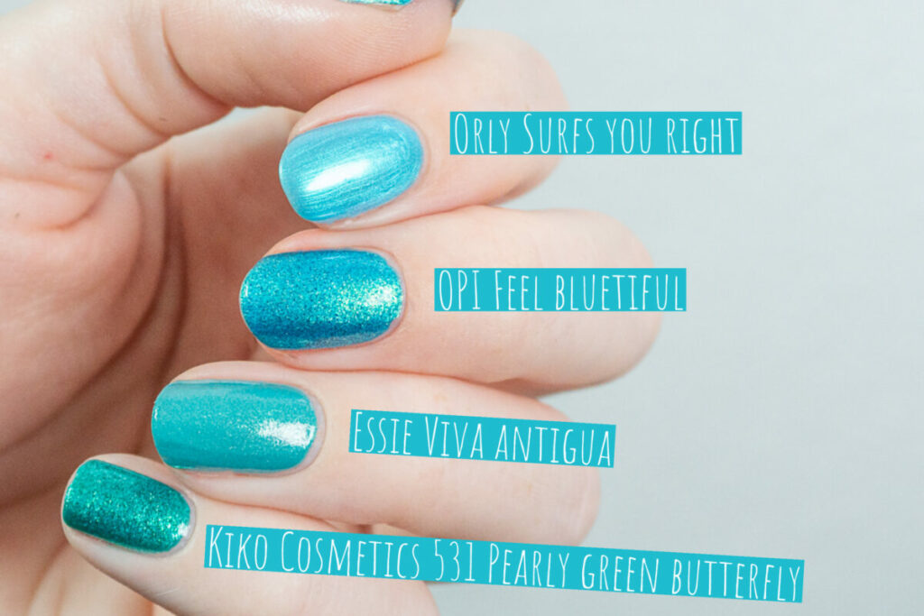
Let me start by saying that I obviously don’t own anything like OPI Feel bluetiful. Orly Surfs your right came immediately to mind, because it is another recently released shimmery turquoise shade. Obviously, the shimmer is much finer than in OPI Feel bleutiful, but the color itself is also much lighter. Essie Viva Antigua used to be my absolute favorite turquoise shimmer, but compared to Feel bluetiful it’s a bit dull and boring and the golden shimmer doesn’t stand out that nicely as in Feel bluetiful.
Finally, I also included Kiko Cosmetics 531 Pearly green butterfly. This shade is sadly discontinued, but I think a lot of Europeans will remember these Kiko shades. The shimmer in Feel bluetiful is very similar to these old Kiko shades (yes, they had a whole range). Pearly green butterfly was the closest in my collection, but it just contains a lot more green than Feel bluetiful.
OPI Exercise your brights
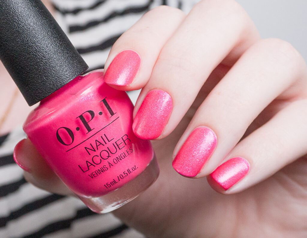
OPI Exercise your brights is a shimmery hot pink. It contains the same glitter flecks as Feel bluetiful, but then not gold bit lighter pink. The base color is incredibly bright and I would almost call it a neon. It took me three coats to get this polish opaque, and I would say that the formula is slightly better than that of Feel bluetiful.
The shade again dries to a matte finish, and I again think that it’s beautiful that way. If you really want the shimmer to stand out, then I would suggest using a topcoat.
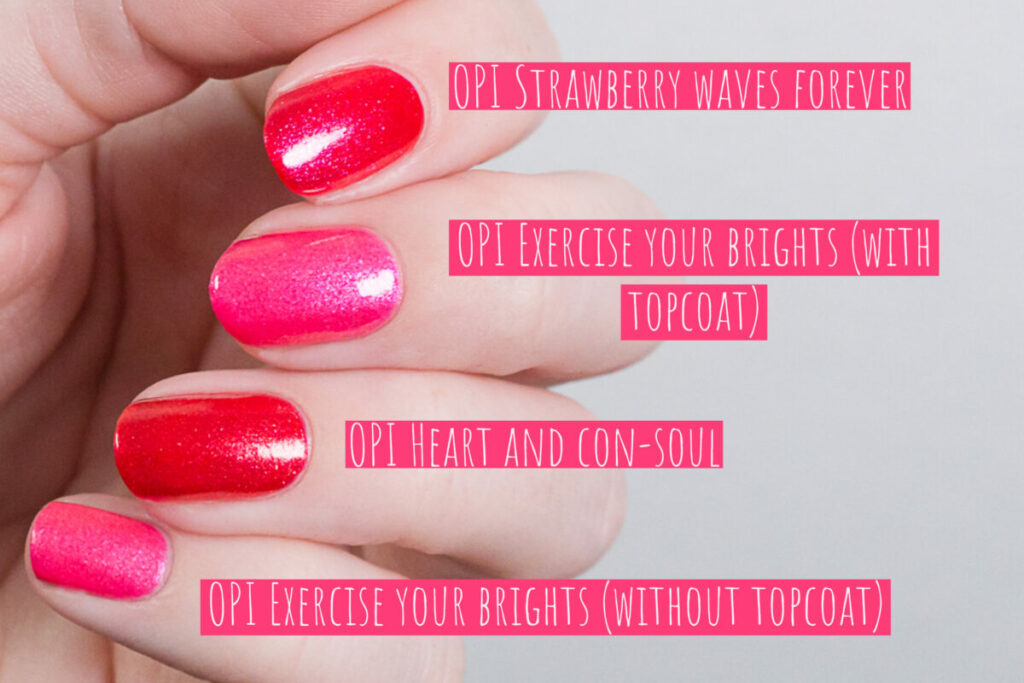
I thought OPI Strawberry waves forever and OPI Heart and con-soul could be close. However, once I pulled them out of their drawer, I realized they both contained way too much red to be dupes. Also, both OPI Heart and con-soul and Strawberry waves forever were much easier to apply and dried glossy. I would say I like Exercise your brights the most though.
OPI Don’t wait. Create.
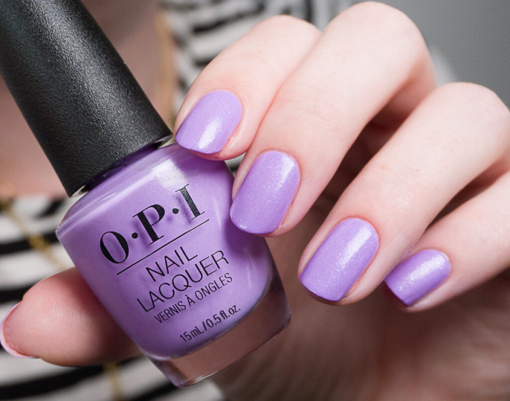
This is OPI Don’t wait. Create. a shimmery light purple. The sparkles in this color seem to be a bit sparser than in OPI Feel bluetiful and Exercise your brights, but they are still really pretty. I also found this one easier to apply than Exercise your brights and Feel Bluetiful. I had to do three coats for opacity, but I think you will get this one opaque in two coats if you’re using thicker coats. Again, this shade dries semi-matte, but I feel like it doesn’t dry as matte as Feel bluetiful and Exercise your brights.

There was one shade I had to think of when I saw OPI Don’t wait. Create. for the first time, and that was Essie Full steam ahead. It’s an oldie, but I though the comparison would be interesting since it has pretty much the same shimmer. Essie Full steam ahead is not as bright, and contains more blue. OPI Don’t wait. Create. is much more vibrant, but it does contain the same sort of shimmer. OPI Achievement unlocked and Orly Provence at dusk are both lighter.
OPI Make rainbows

Next up is OPI Make rainbows. It’s the only one that I regret picking up a little bit. Make rainbows is a shimmery lime green. The shimmer in this one is much finer than in the other shades I have tried, and that’s why this is my least favorite shade. In the right lighting, this shade has a blue shift, but it is much more subtle than I expected. I again needed three coats for opacity but it was easy to apply. To my surprise, this one also dries semi-matte.
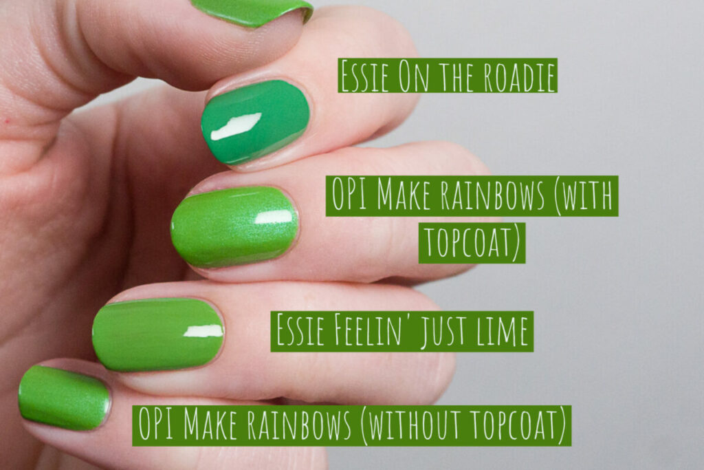
I feel like OPI Make rainbows has exactly the same base color as Essie Feelin’ just lime. So if you already own Feelin’ just lime, you will know what the color of OPI Make rainbows is. Feelin’ just lime is definitely not my favorite Essie green in terms of color. Also for Make rainbows, I just which they would have gone for a lighter, brighter color.
OPI Sky true to yourself
This one is called OPI Sky true to yourself, and I think we definitely know where OPI got their inspiration. This shimmery light blue is absolutely gorgeous. It contains the same translucent glitter flecks as Exercise your brights, but next to this it also contains a much finer blue shimmer. It’s absolutely pretty!
The downside was that I again needed four coats. I would argue that this color is worth it, but it is a tiny bit frustrating. Again, the shade dries to a soft-matte finish without topcoat.
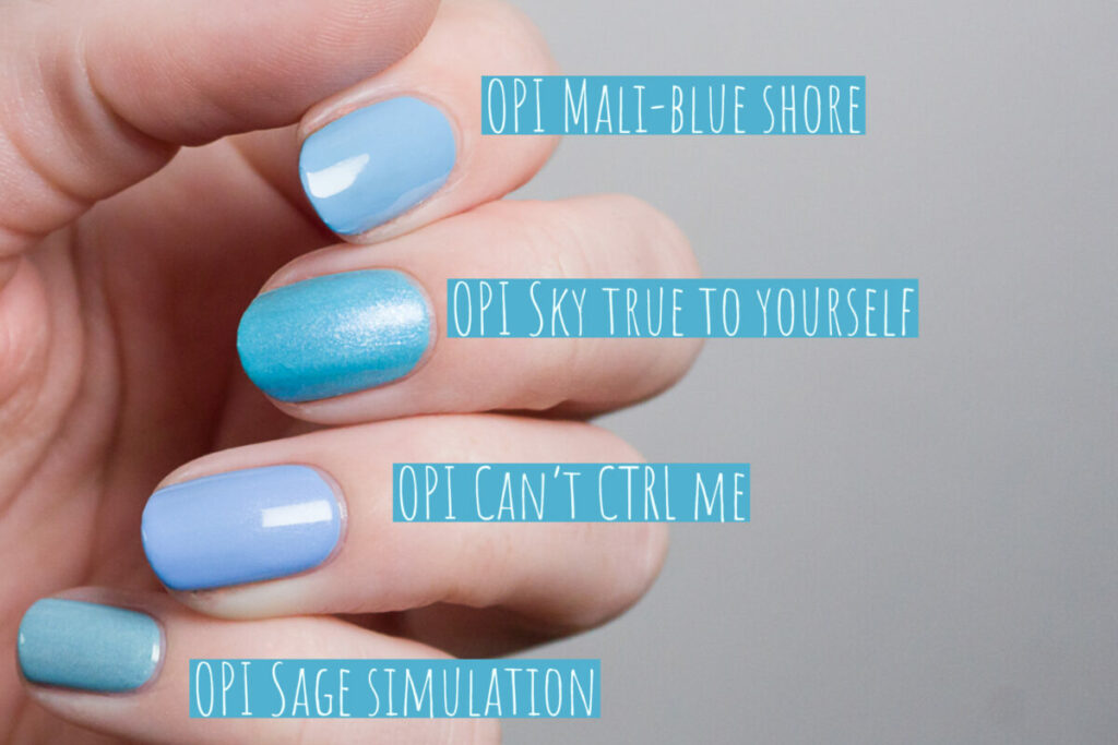
OPI already did a lot of these lighter blue shades the past year. OPI mali-blue shore is the closest in terms of color, but it is not as vibrant and bright as Sky true to yourself. OPI Can’t CTRL me contains much more purple and has a very fine silver shimmer. OPI Sage simulation is dustier than Sky true to yourself.
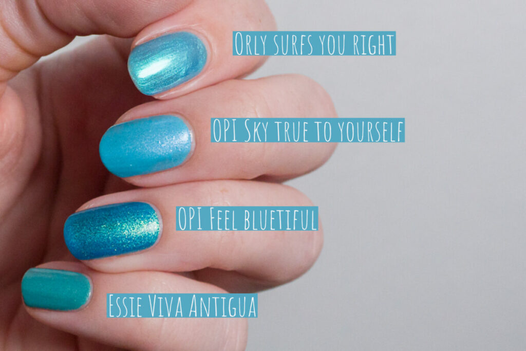
I received a question on Instagram to compare Orly Surfs you right and OPI Sky true to yourself. In my head they were completely different, but they were closer than I expected (not super close though). The shimmer in Surfs you right is much finer and has a very strong green flash, therefore the polish seems to lean more green overall.
You can also clearly see the difference between Feel bluetiful and Sky true to yourself in this picture!
OPI Go to grape lengths
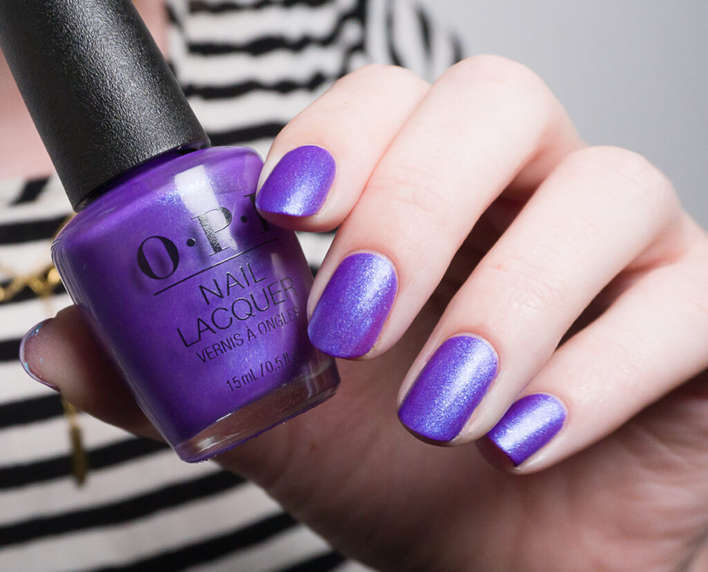
Finally, last but not least we have OPI Go to grape lengths. This is the darker purple from the collection. The polish is just filled with the same silver flecks plus, but also contains finer blue shimmer. I’m wearing no topcoat in the picture, but I absolutely love how this one looks with topcoat.
It took me three coats for opacity, but under my bright lights I still saw some patchy areas, so I would say that this one is probably opaque in three thicker coats. The color is just stunning, and reminds me of indie nail polish.
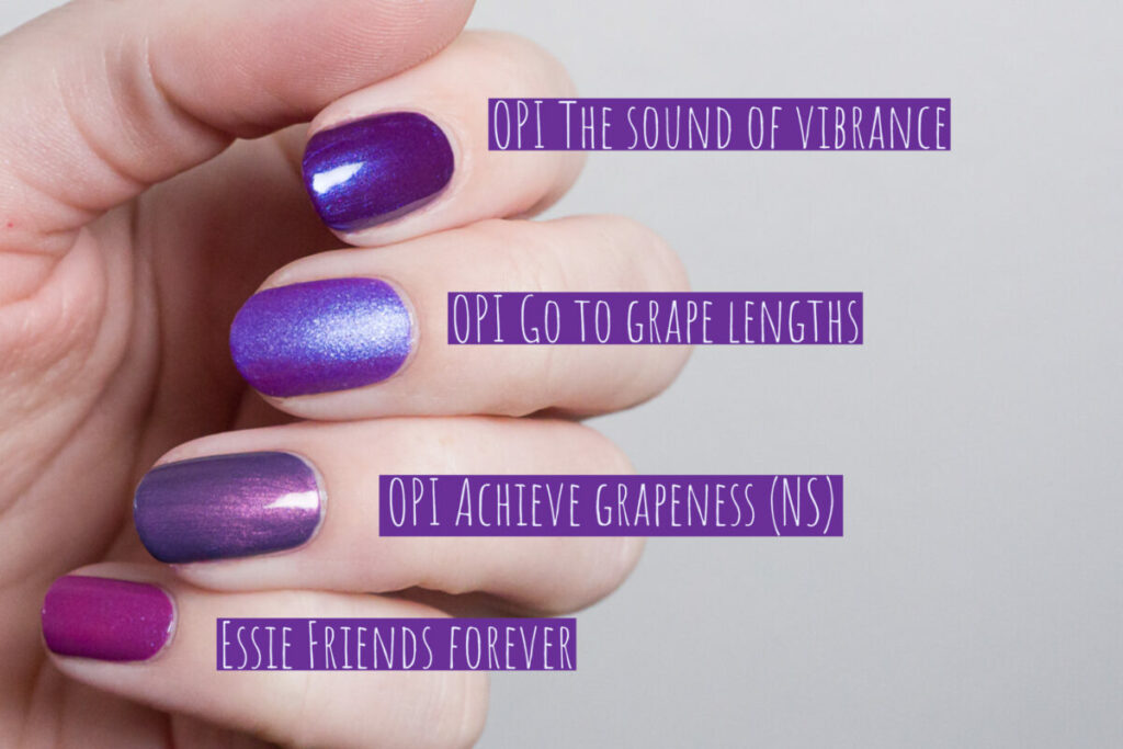
I love these types of shimmery purples, so I had a lot to compare. The one I was most curious about was OPI The sound of vibrance. Its not a dupe for Go to grape lengths, because the sound of vibrance is darker, the blue shimmer is finer and it dries glossy. It has a similar concept to Go to grape lengths though, because they are both medium purples with a blue flash. OPI Achieve grapeness just has a completely different type of base color and shimmer than Go to grape lengths. Also, the shimmer and base color of Essie Friends forever is just different from OPI Go to grape lengths.
Conclusion & Availability
I feel like this is again a great collection by OPI. I’m very much in love with all of these shades, and I regret not picking up the others. I do want to say that the formula of all these shades is not super beginner-friendly. You can work with it, and definitely reach opacity, but you cannot really ‘work’ the formula too much. At the same time, the formula is not bad at all, it’s just not as easy as some cremes.
I picked up these shades from Polishpick.com. You can also find them on Amazon over here (affiliate link), or on Beyond Polish over here (affiliate link). There are also two minisets available, one with four shades, and one with six shades. They are really nice if you just want to try some of these shades!
Disclaimer: This blog post contains affiliate links. Meaning that if you buy a product through one of these links, I might receive compensation at no additional cost to you. I marked all affiliate links clearly with the label “affiliate link”, all other links are regular links. As an Amazon Associate, I earn from qualifying purchases.