
Nope, this is not a typo, I’m really swatching Essie’s Spring 2003 collection today. I’ve been preparing this post for a while now since it wasn’t super easy to get my hands on the shades. But I eventually managed to do so! The Essie Central park collection is the original collection of Essie’s Fifth Avenue, and that’s how I originally came across this collection. I couldn’t find a lot of information about it, so I thought it would be fun to share!
Essie labels and bottles throughout the years
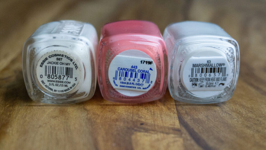
If you decide to go hunt for old Essie’s, you might notice that the labels (and sometimes even the bottles) are quite different from current day Essie’s. The bottles I own from this collection, are not made in 2003 but are produced later. I was able to tell by looking at the label. The original Essie label from 2002-2008ish is round, has ‘www.Essie.com’ on the label and it says ‘Dist. Astoria’. If the label is blue and doesn’t have Astoria and the Essie website, it is probably a later-produced shade, which is what I have. Based on the labels on my bottles, my bottles are produced after 2008. So I think all of the colors in this collection might have stayed for a while in the permanent collection. Meaning all of these shades shouldn’t be very hard to find.
The collection
Sadly, I couldn’t find the original pictures from Essie of this collection. I did find their original description using the Wayback Machine:
Essie® takes you on a spring time tour of one of the world’s most famous parks, with the spring 2003 Central Park Collection. Explore the unique landscapes as you enter her enchanted turf… and share her adventure in spring colors. This spring, fashions are an eclectic mix of retro dresses and skirts, to tailored military inspired jackets over baggy pants. Designers are leaning towards the soft, flowy, feminine fabrics of chiffon and silk in gentle colors, leading the way for a bright palette of nail colors. Match your polish to your sandals and make a vibrant entrance to all spring time soirées!
“The Central Park Collection emphasizes the expectation of color as the seasons change,” says Essie Weingarten.
Essie.com in 2003 (http://web.archive.org/web/20030401115124/http://essie.com:80/style/index.php?sub=essiespoint)
The original description of the shades on the Essie website is:
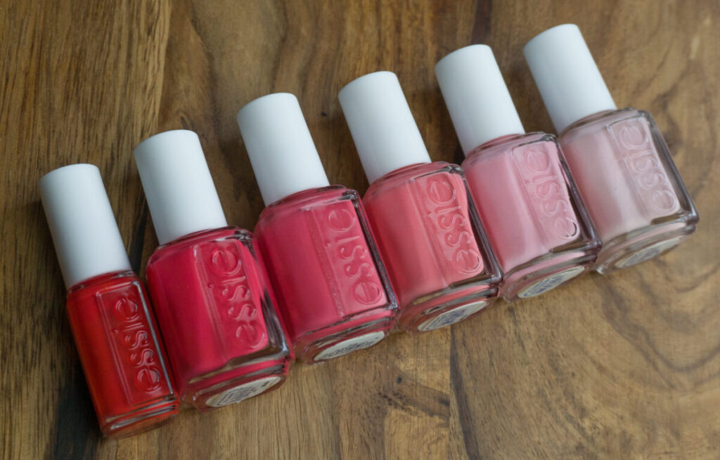
- Bike ride (a delicate lavender)
- Lily pond (a luscious pink)
- Carousel coral (Spring soft coral)
- Plaza sweet (sweetheart coral rose)
- Boat house (Fuchsia pink)
- Fifth Avenue (Sophisticated orange red)
The names are so cute! Fifth Avenue is still in production in Europe, but should also be easy to find in the US. It seems like Carousel coral and Boat house were also still recently being made in the US since people have been finding them at TJ Maxx with a modern label.
I must say that this collection really consists of a lot of pinks and reds! It is kind of characteristic for the time it was released in! People were complaining all the time that Essie was doing too many reds, pinks, and sheers.
I won’t keep you waiting any longer, let’s check out the shades!
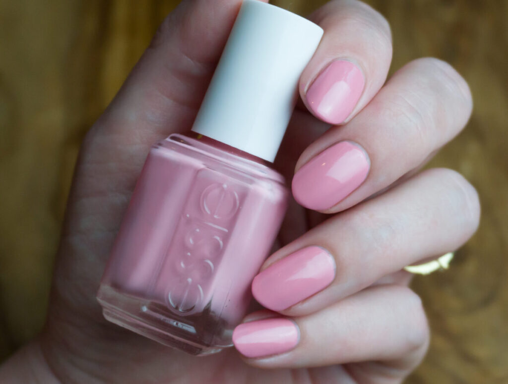
Essie Bike ride
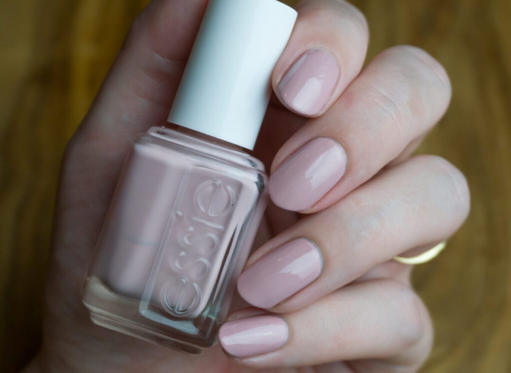
Essie describes Bike ride as a delicate lavender. It makes me wonder whether my bottle is discolored. I must say that on the rare swatches that I have seen, this color already looks like this, so maybe Essie just changed the shade over time or it is meant to be like this all along. In the bottle, the color also seems to contain some shimmer, but it doesn’t show up on the nail. The color is a mix of pink and nude with a hint of purple. With the tiny Essie brush, this shade is horrible to apply. However, I always have a spare wide brush from an empty bottle of topcoat laying around. Once I swapped the tiny brush for the wide brush, I was surprised how well this shade still applied. I still had to use three coats, but that’s pretty standard for this type of light pink shade. Also, a modern-day topcoat helps smooth out this polish a lot!
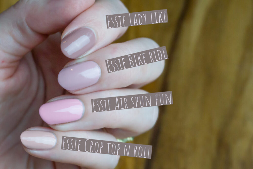
I was convinced I would have a dupe for this polish, but it turned out that it was pretty difficult to find an alternative for this shade in the current Essie collection. The strange thing about Bike ride is that it is a mix of pink and nude, and that’s pretty difficult to find. I’m comparing Bike ride to Essie Lady like, Essie Crop top ‘n roll and Essie Air spun fun. I first thought Air spun fun would be a good dupe, but it is way too pink. Crop top ‘n roll is too orange and Esie Lady like is too dark, but it is also this mix of nude and purple just like Bike ride.
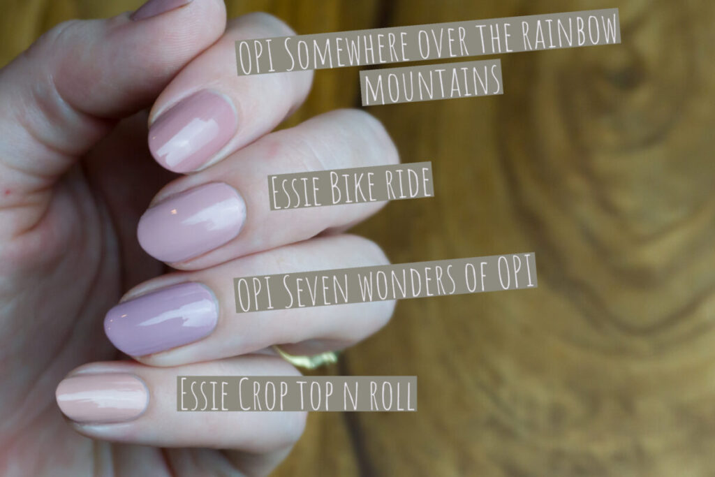
I had the feeling that I would have something more similar in my OPI stash. I compared it to OPI Seven wonders of OPI which is a little bit more purple, and OPI Somewhere over the rainbow mountains which is a bit browner. Overall, both shades have a very similar vibe as Bike ride, although they are not exact dupes
Essie Lily pond
Essie calls Lily pond ‘a luscious pink’. It’s a light, slightly dusty pink creme, but not as light as Ballet slippers and Fiji. I think the name is super cute and fits the polish! There actually used to be a small lake in Central Park called ‘the lily pond’, but it ran dry somewhere during the 20th century. Maybe Essie remembered the pond? The formula of Lily pond is better than of Bike ride, so I was able to apply it with the small brush. Some nails already looked pretty decent after two coats, but I ended up using three coats for the pictures. Again, topcoat is a must with this shade, because it doesn’t dry very shiny.
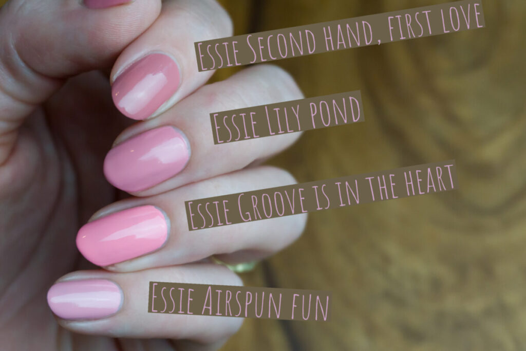
I think you can clearly see in this picture that Essie’s Lily pond is a bit muted. Essie Second hand, first love has a similar feel but is browner. Essie Groove is in the heart is very bright compared to Lily pond and Essie Air spun fun is too light to be a dupe, but it is muted in a similar way as Lily pond.
Essie Carousel coral

Essie Carousel coral is described as a ‘spring soft coral’. To me, it is just a muted coral. The moment I saw this polish, I just knew I had to have a lot of similar shades in my stash. I was able to find quite a few swatches of this shade online which makes me believe that this shade was actually around for quite a long time. The formula was very similar to bike ride, so after two coats I pulled out my wide brush. I did three coats in the pictures, but I think that if I would have used the wide brush from the start, I might have gotten away with two.

Essie Ice cream and shout is very close, but I have the feeling that it is still a bit darker and too pink to be an exact dupe. Flying solo is too dark and too pink, and Stones ‘n roses is too light. I think there are shades in Essie’s permanent collection that are even closer to Carousel coral, but I currently do not own them.
Essie Plaza Sweet
Plaza Sweet is described by Essie as a ‘Sweetheart coral rose’. It’s a bit darker and pinker than Carousel coral, but it is closer than I expected. The polish is a bit sheer, so I had to use three coats for complete opacity. It did apply and dry very fast, so it was no problem.
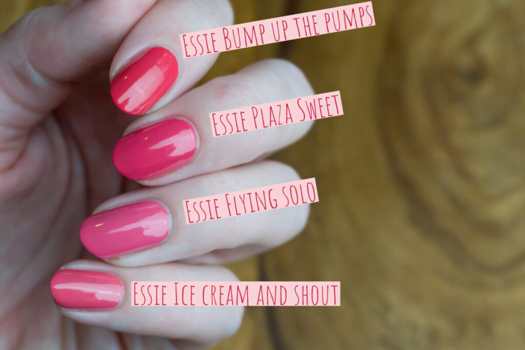
Again, I don’t have exact dupes for this shade. I do want to mention that the formula of the modern shades is much more opaque than the formula of Plaza sweet. I personally definitely prefer the newer shades, even if they are not exact dupes. Bump up the pumps looked very similar in the bottle, but is a tad too orange on the nail. Flying solo and Ice cream and shout are both too light, although Ice cream and shout looks exactly like a lighter version of Plaza sweet.
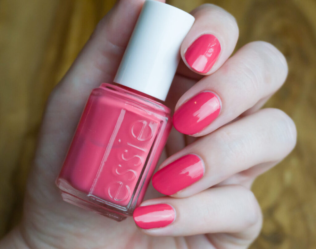
Essie Boat house
Boat house has been described as a ‘Fuchsia pink’. To me, it just looks like a pink-leaning red that Essie seems to release every year during a spring/summer collection. I have seen some recent swatches of this shade, which makes me believe that this shade is only discontinued recently. My jaw dropped when I applied the shade, it is almost opaque on the first coat, although I had to use two coats to make it cover completely.
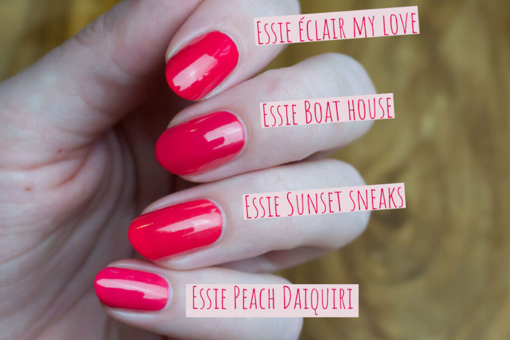
The shades I’m showing here are all not 100% dupes, but I would say 95% dupes. Éclair my love is probably the closest, but a little bit too bright. Sunset sneaks and Peach Daiquiri are also extremely close.
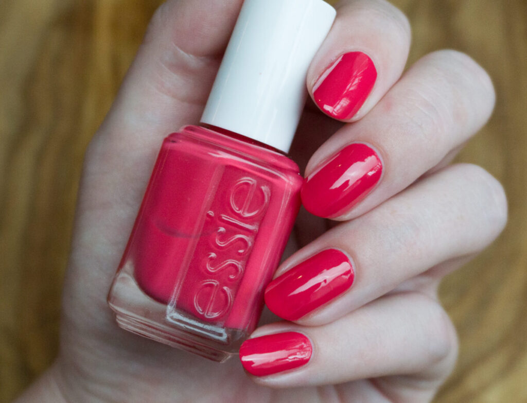
Essie Fifth avenue
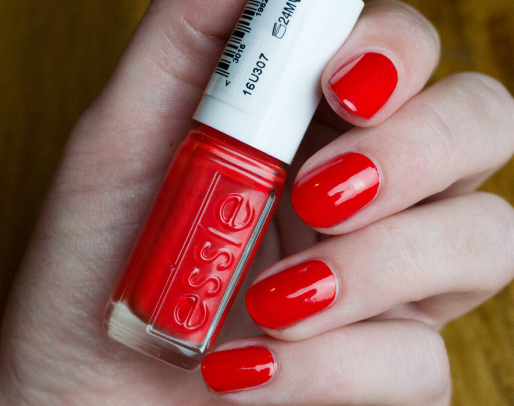
I’ve talked a lot about Fifth Avenue on my blog already. This is a bottle that it sold nowadays, so I don’t know if the shade changed over time. At least this version is an amazing shade. Essie’s original description was ‘a sophisticated orange red’, which has evolved into ‘a creamy red orange blend lacquer’ on their current website. At least the modern formula that I have of this shade is amazing. It is pretty much opaque in one coat (I’m wearing two in the picture though). Sadly I noticed that the shade recently got discontinued in the US, but it should still be easy to find. In Europe, this color is still in Essie’s permanent collection, which is the reason that I found this collection!
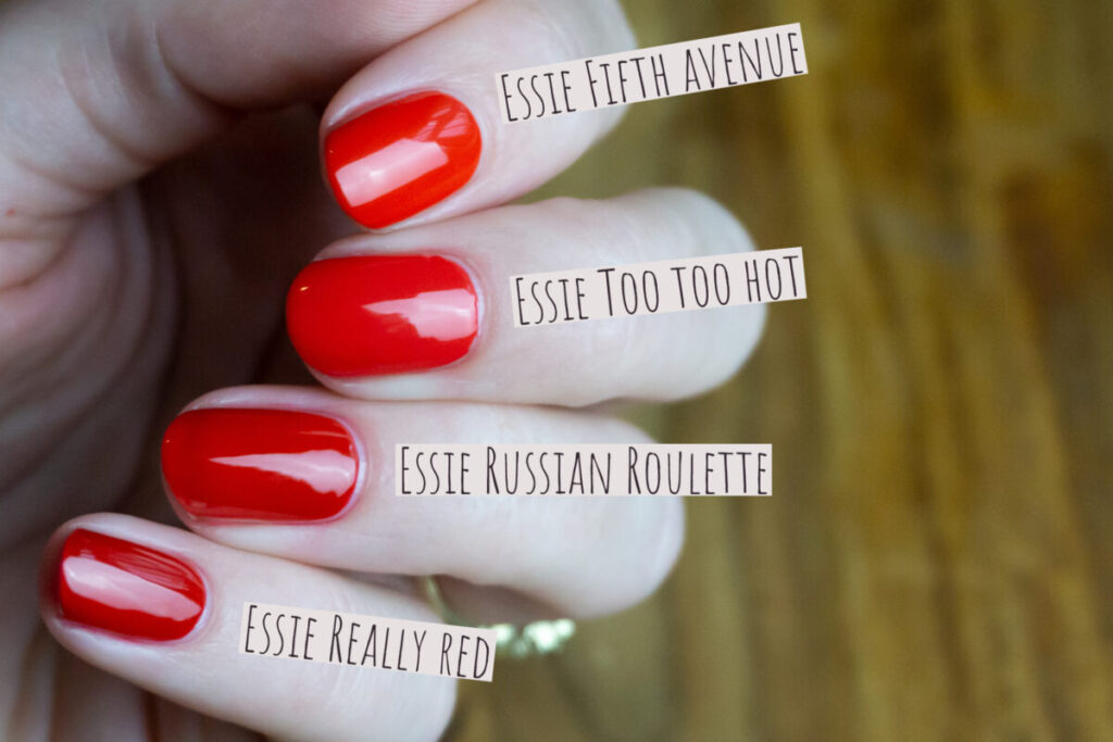
Just for completeness, I added in this comparison too. I originally did it for my Essie red comparison post, so if you are a frequent reader, it might look familiar. Essie Too too hot maybe looks similar but is too pink to be an exact dupe. Both Essie Russian roulette and Essie Really red are too dark to be dupes.
Conclusion

While my first reaction to this collection was ‘mehh, just a boring pink collection’, I really fell in love when swatching this collection. I realized that Essie Bike ride and Lily pond are actually quite unique. I think it is easy to find some good dupes for the other shades in this collection, but it is just the overall theme of this collection that makes it so nice. I really like it, and I’m really glad that I had the opportunity to add it to my collection.
Regarding ridiculous prices on Ebay
I just quickly want to mention that I have seen some of these shades for ridiculous prices over on eBay. The shades are definitely not worth it. In my experience, newer Essie shades just have better formulas, more opaque formulas, and the wide brush is much nicer. If you are just a regular polish user, it is not worth it to pay a high price for these shades, but it is better to just look for dupes in Essie’s current collection.


These look okay 😀
I like these better than the 2004 shades. At least they are not sheer!